
Data Visualization with Python for Beginners
Data Visualization with Python for Beginners, available at $59.99, has an average rating of 4.51, with 56 lectures, based on 4754 reviews, and has 17567 subscribers.
You will learn about Make line plots in Python Make scatter plots in Python Make 1-dimensional and 2-dimensional histogram plots Customize your plots by adding colour and changing line styles Customize your axis by changing the tick labels Add custom titles and labels to your plots Add custom text to your plots Adjust the size of your figures Add a legend to your plots Be able to save your figures in a desired format to your computer Change the scale of the axis to better graph logarithmic data This course is ideal for individuals who are Anyone interested in analyzing data or Anyone who needs to visualize data or People who want to incorporate data visualization into their code or Anyone who is interested in expanding their Python knowledge It is particularly useful for Anyone interested in analyzing data or Anyone who needs to visualize data or People who want to incorporate data visualization into their code or Anyone who is interested in expanding their Python knowledge.
Enroll now: Data Visualization with Python for Beginners
Summary
Title: Data Visualization with Python for Beginners
Price: $59.99
Average Rating: 4.51
Number of Lectures: 56
Number of Published Lectures: 56
Number of Curriculum Items: 56
Number of Published Curriculum Objects: 56
Original Price: €29.99
Quality Status: approved
Status: Live
What You Will Learn
- Make line plots in Python
- Make scatter plots in Python
- Make 1-dimensional and 2-dimensional histogram plots
- Customize your plots by adding colour and changing line styles
- Customize your axis by changing the tick labels
- Add custom titles and labels to your plots
- Add custom text to your plots
- Adjust the size of your figures
- Add a legend to your plots
- Be able to save your figures in a desired format to your computer
- Change the scale of the axis to better graph logarithmic data
Who Should Attend
- Anyone interested in analyzing data
- Anyone who needs to visualize data
- People who want to incorporate data visualization into their code
- Anyone who is interested in expanding their Python knowledge
Target Audiences
- Anyone interested in analyzing data
- Anyone who needs to visualize data
- People who want to incorporate data visualization into their code
- Anyone who is interested in expanding their Python knowledge
Data and analytics are becoming increasingly important in our world and in modern day businesses. Usually data analytics at one point or another also means including or creating graphics. This can help you get a better sense of the data as well as help you better communicate your findings to others.
Python is a favourite among data professionals, and performing analytics in Python is becoming increasingly more common. Therefore, it’s great to be able to also directly create custom graphs alongside all the analytics.
In this course we’ll start with some basic setup, and then get into different types of plots that we can create as well as how we can customize them.
We’ll start off covering basic line and scatter plots, just to get a hang of the library, and then move further to create a larger variety of graphs. You’ll learn how to add error bars, how to use and represent colours for intensities, how to use images in your plots, as well as how to create 3d plots.
Additionally, we’ll spend some time looking at the customization options that Matplotlib provides, so that we can change the way our axes and axis ticks and labels look, learn how to add annotations and math formulas, or also how to hide parts of a graph so that we have a reduced and cleaner version.
Course Curriculum
Chapter 1: Setup and Installation
Lecture 1: Introduction to Matplotlib and Installing Anaconda
Lecture 2: Jupyter Notebooks Intro
Lecture 3: Inline Plotting
Chapter 2: Line and Scatter Plots
Lecture 1: Making a Scatter Plot
Lecture 2: Understanding Figures
Lecture 3: Creating Axes
Lecture 4: Making a Line Plot
Lecture 5: Exercise Sheet 1 Intro
Lecture 6: Reading the Data From Txt File
Lecture 7: Reading the Data From CSV File
Lecture 8: Data Visualization Sheet 1 Exercise 1 Solution
Lecture 9: Data Visualization Sheet 1 Exercise 2 Solution
Chapter 3: Graph Customization, Annotation, and Formatting
Lecture 1: Changing the X and Y Limits
Lecture 2: Adding a Title and Axis Labels
Lecture 3: Adding in Equations Into Text
Lecture 4: Adding and Formatting Axis Ticks
Lecture 5: Customizing Tick Labels
Lecture 6: Data Visualization Exercise Sheet 2
Lecture 7: Data Visualization Sheet 2 Exercise 1 Solution
Lecture 8: Data Visualization Sheet 2 Exercise 2 Solution
Lecture 9: Adding a Legend
Lecture 10: Adding Text Annotations
Lecture 11: Customizing our Graph Edges
Lecture 12: Using Plot Styles
Lecture 13: Saving Our Plots
Lecture 14: Data Visualization Exercise Sheet 3
Lecture 15: Data Visualization Sheet 3 Datetime Intro
Lecture 16: Data Visualization Sheet 3 Exercise 1 Solution
Lecture 17: Data Visualization Sheet 3 Exercise 2 Solution Part 1
Lecture 18: Data Visualization Sheet 3 Exercise 2 Solution Part 2
Lecture 19: Data Visualization Sheet 3 Exercise 2 Solution Part 3
Lecture 20: Data Visualization Sheet 3 Exercise 3 Solution
Chapter 4: Histograms, Bar Graphs, Pie Charts, and Additional Graphs
Lecture 1: Histograms
Lecture 2: Advanced Histograms and Patches
Lecture 3: Bar Graphs
Lecture 4: Error Bars on Bar Graphs
Lecture 5: Box and Whisker Plots
Lecture 6: Pie Charts
Lecture 7: 2-Dimensional Histograms
Lecture 8: Data Visualization Exercise Sheet 4
Lecture 9: Data Visualization Sheet 4 Exercise 1 Sample Solution
Lecture 10: Data Visualization Sheet 4 Exercise 2 Sample Solution
Lecture 11: Data Visualization Sheet 4 Exercise 3 Sample Solution
Lecture 12: Data Visualization Sheet 4 Exercise 4 Sample Solution
Lecture 13: Data Visualization Sheet 4 Exercise 5 Sample Solution
Chapter 5: Images and Color Scales
Lecture 1: Loading and Showing Images
Lecture 2: Colormaps
Lecture 3: Adding a Colorbar to Our Axis
Lecture 4: Data Visualization Exercise Sheet 5
Lecture 5: Data Visualization Sheet 5 Exercise 1 Sample Solution
Lecture 6: Data Visualization Sheet 5 Exercise 2 Sample Solution Part 1
Lecture 7: Data Visualization Sheet 5 Exercise 2 Sample Solution Part 2
Chapter 6: 3D Graphing & Animating
Lecture 1: 3D Line and Scatter Plots
Lecture 2: Changing View Angles and Animating Our Graphs
Lecture 3: Data Visualization Exercise Sheet 6 Intro
Lecture 4: Data Visualization Sheet 6 Exercise 1 Sample Solution
Instructors
-

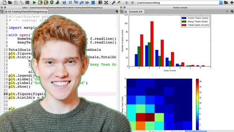
Max S
Data Engineer

Rating Distribution
- 1 stars: 26 votes
- 2 stars: 65 votes
- 3 stars: 576 votes
- 4 stars: 1876 votes
- 5 stars: 2210 votes
Frequently Asked Questions
How long do I have access to the course materials?
You can view and review the lecture materials indefinitely, like an on-demand channel.
Can I take my courses with me wherever I go?
Definitely! If you have an internet connection, courses on Udemy are available on any device at any time. If you don’t have an internet connection, some instructors also let their students download course lectures. That’s up to the instructor though, so make sure you get on their good side!

- Best Video Editing Courses to Learn in March 2025

- Best Music Production Courses to Learn in March 2025

- Best Animation Courses to Learn in March 2025

- Best Digital Illustration Courses to Learn in March 2025

- Best Renewable Energy Courses to Learn in March 2025
- Best Sustainable Living Courses to Learn in March 2025
- Best Ethical AI Courses to Learn in March 2025
- Best Cybersecurity Fundamentals Courses to Learn in March 2025
- Best Smart Home Technology Courses to Learn in March 2025
- Best Holistic Health Courses to Learn in March 2025
- Best Nutrition And Diet Planning Courses to Learn in March 2025
- Best Yoga Instruction Courses to Learn in March 2025
- Best Stress Management Courses to Learn in March 2025
- Best Mindfulness Meditation Courses to Learn in March 2025
- Best Life Coaching Courses to Learn in March 2025
- Best Career Development Courses to Learn in March 2025
- Best Relationship Building Courses to Learn in March 2025
- Best Parenting Skills Courses to Learn in March 2025
- Best Home Improvement Courses to Learn in March 2025
- Best Gardening Courses to Learn in March 2025